14/01/2022
Here at Research in Finance we are running more and more UX testing and Usability testing for our asset manager clients.
This article will give you some elements that asset managers and indeed any business should consider when developing their websites and micro sites.
Do reach out to George Brough to discuss any aspects of this article.

Having a website is an important asset for any business; a website can help a business to grow, to increases revenue, to provide an online presence which can be accessed around the clock (24/7/365), giving us a unique platform to engage with our customers and to develop our company brand… and ultimately to help us achieve our business goals.
However, websites are often an overlooked business asset.
It is important to put considerable thought into your website, when designing, developing and managing your website.
Consideration of these 5 elements will help ensure the success of your website and help it achieve a greater impact and improve its users’ experience and enjoyment.
1. Do User Research & User Testing
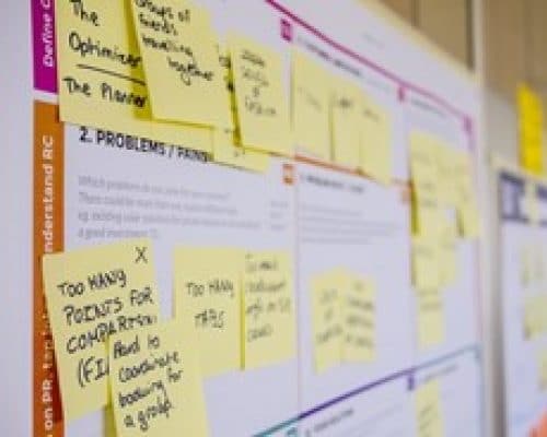
Remember, you are not the target user of the website. It is important to carry out in-depth research of your users and to do user testing, through qualitative & quantitative research and through observational techniques.
This in-depth research and testing will assist in identifying the specific users who will use your website, the problems they seek to solve, any pain points and frustrations they may encounter, and how best to hypothesise/or to facilitate a solution to those problems. Ultimately, this research will allow you to better design and develop your website to meet its full potential.
User research is important both before, during and after a website design & development. Comprehensive user testing (i.e. through usability testing, card sorting or interviews etc.) will improve your websites design and ensure any design assumptions/solutions are fully validated, leading to the overall success of the website.
Research & Test, early and often, to ensure success.
2. Plan the Structure & Navigation

Don’t overlook a websites Information architecture; this is the skeletal structure of the website and identifies where content and specific pages will be located.
This can be influenced by the primary navigation, but not all navigation, and has a big impact on the user’s experience. In essence it is the high-level map of a websites structure, its pages, its content and its organisation.
To best design the information architecture, some tips are:
Complicated and confusing information architecture (and therefore navigation) leads to user frustration and bad a user experience of a website. Keep it simple, logical and organised.
3. Be Aware of Design Principles
Design principles are universal design truths, and if used correctly, can ensure the website being designed is of a high standard which the user can effortlessly follow and flow through.
Some examples to keep in mind when developing your website are:
Keep design principles clear, visible and understandable to your users.
4. Don’t Overlook Design Patterns
Digital patterns are useful tools and techniques that make your information/content and user actions stand out. When done well they can help the user flow through your website effortlessly and create a better user experience.
Some examples to consider are:
Keep design patterns simple, structured, visible and understandable to your users.
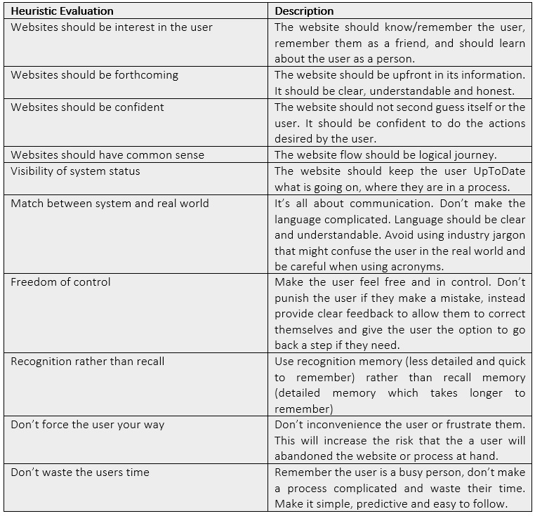
5. Evaluation
Remember to evaluate your website, and often, does it adhere to user experience best practice or not? Remember, evaluation is not a substitute for in-depth user research and testing, but it can aid in identifying where within your website may be letting you down or not performing well.
Below is a table of important heuristics to consider when evaluation a website and assessing if a website meets user experience best practice.
George recently joined the Research in Finance team in 2021 and holds the Diploma in User Experience Design with the UX Design Institute (Glasgow Caledonian University). George is looking to develop his career in Research and in User Experience Research & Design. He supports the qualitative team across multiple projects and assists with the managements of our online communities. George also brings with him his passion and knowledge of User Experience Research & Design. Prior to working in the financial service at Research in Finance, George spent 12 years as a Quantity Surveyor, in the construction industry, managing the construction project finances on various projects from small bespoke housing, historical buildings, to multimillion-pound commercial developments. However, his passion for research and for solving users digital problems lead him to this exciting career change.